Converting Ensembles
This notebook takes you through the process of converting Ensembles from one parameterization to another in detail, and covers some of the things to watch out for when converting.
import qp
import numpy as np
from scipy import stats
import matplotlib.pyplot as plt
First let’s read in an Ensemble of Gaussian mixed model distributions.
ens = qp.read("../assets/test.hdf5")
ens
Ensemble(the_class=mixmod,shape=(100, 3))
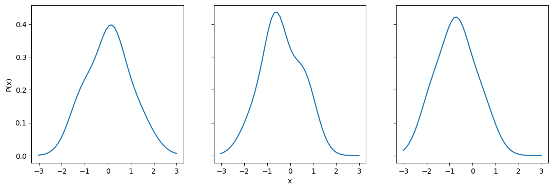
Now that we have our Ensemble, let’s take a look at a few of the distributions.
fig, axes = plt.subplots(1,3, sharex=True, sharey = True, figsize=(13,4))

axes[0].plot(ens.x_samples(),ens[2].pdf(ens.x_samples()))
axes[1].plot(ens.x_samples(),ens[15].pdf(ens.x_samples()))
axes[2].plot(ens.x_samples(),ens[53].pdf(ens.x_samples()))
axes[1].set_xlabel("x")
axes[0].set_ylabel("P(x)")
Text(0, 0.5, 'P(x)')
Converting to histograms and back
Now let’s convert the Ensemble to histograms. We need to pick a set of bin edges that covers the whole range of values. Since x_samples() goes from (-3,3), we know that this range should cover the majority of distribution area for all of the distributions. However, for Gaussian mixed models it is possible for some of the distribution to be outside this range, particularly if it’s the tail end. So let’s add a bit on either side and do (-4,4) to make sure we cover the appropriate range.
bins = np.linspace(-4,4,41)
ens_h = qp.convert(ens, "hist", bins=bins)
fig, axes = plt.subplots(1,3, sharex=True, sharey = True, figsize=(13,4))


# we use a bar to plot the histogram since we already have the histogram values
axes[0].bar(ens_h.x_samples(),ens_h[2].pdf(ens_h.x_samples()), width=ens_h.x_samples()[1]-ens_h.x_samples()[0], alpha=0.9)
axes[0].plot(ens.x_samples(),ens[2].pdf(ens.x_samples()),c="k")
axes[1].bar(ens_h.x_samples(),ens_h[15].pdf(ens_h.x_samples()), width=ens_h.x_samples()[1]-ens_h.x_samples()[0], alpha=0.9)
axes[1].plot(ens.x_samples(),ens[15].pdf(ens.x_samples()),c="k")
axes[2].bar(ens_h.x_samples(),ens_h[53].pdf(ens_h.x_samples()), width=ens_h.x_samples()[1]-ens_h.x_samples()[0], alpha=0.9, label="converted")
axes[2].plot(ens.x_samples(),ens[53].pdf(ens.x_samples()),c="k", label="original")
axes[1].set_xlabel("x")
axes[0].set_ylabel("P(x)")
axes[2].legend(loc="best")
fig.suptitle("Converting from Gaussian mixed models to histograms")
Text(0.5, 0.98, 'Converting from Gaussian mixed models to histograms')

The conversion seems to have worked quite well. The distributions we looked at before match up almost perfectly. Now let’s try converting these back to Gaussian mixed models to see if the conversion in the other direction works as well. The main parameter that is relevant for this conversion is how many Gaussians will be used for each distribution (ncomps). Let’s go with the default value, 3, for now.
ens_conv = qp.convert(ens_h,"mixmod",ncomps=3)
fig, axes = plt.subplots(1,3, sharex=True, sharey = True, figsize=(13,4))


# we use a bar to plot the histogram since we already have the histogram values
axes[0].bar(ens_h.x_samples(),ens_h[2].pdf(ens_h.x_samples()), width=ens_h.x_samples()[1]-ens_h.x_samples()[0], alpha=0.9)
axes[0].plot(ens_conv.x_samples(),ens_conv[2].pdf(ens_conv.x_samples()),c="k")
axes[1].bar(ens_h.x_samples(),ens_h[15].pdf(ens_h.x_samples()), width=ens_h.x_samples()[1]-ens_h.x_samples()[0], alpha=0.9)
axes[1].plot(ens_conv.x_samples(),ens_conv[15].pdf(ens_conv.x_samples()),c="k")
axes[2].bar(ens_h.x_samples(),ens_h[53].pdf(ens_h.x_samples()), width=ens_h.x_samples()[1]-ens_h.x_samples()[0], alpha=0.9, label="original")
axes[2].plot(ens_conv.x_samples(),ens_conv[53].pdf(ens_conv.x_samples()),c="k", label="converted")
axes[1].set_xlabel("x")
axes[0].set_ylabel("P(x)")
axes[2].legend(loc="best")
fig.suptitle("Converting histograms to Gaussian mixed models")
Text(0.5, 0.98, 'Converting histograms to Gaussian mixed models')
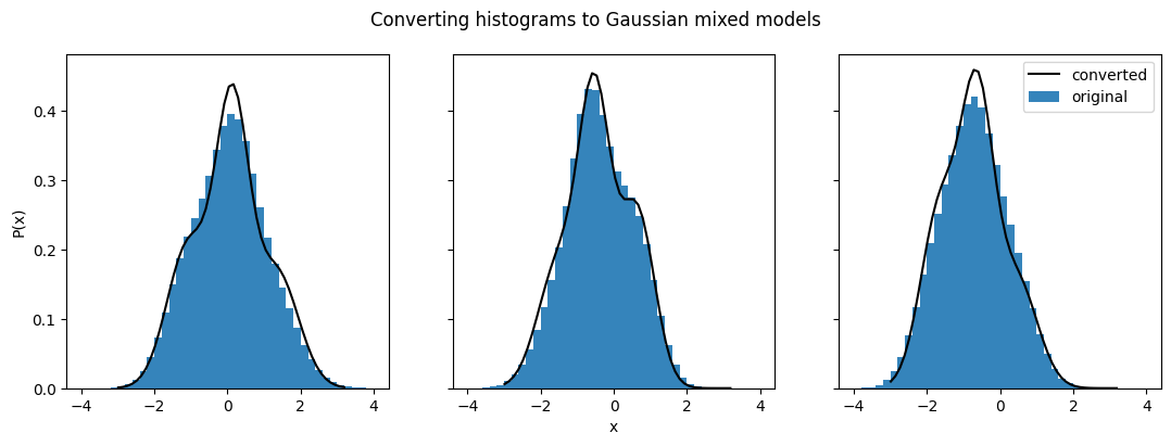
Our converted Gaussian mixed model distributions no longer match the histograms they were converted from as well. We can also compare them back to their original distributions to get a better sense of the differences:
fig, axes = plt.subplots(1,3, sharex=True, sharey = True, figsize=(13,4))

axes[0].plot(ens.x_samples(),ens[2].pdf(ens.x_samples()))
axes[0].plot(ens_conv.x_samples(),ens_conv[2].pdf(ens_conv.x_samples()),linestyle="--")
axes[1].plot(ens.x_samples(),ens[15].pdf(ens.x_samples()))
axes[1].plot(ens_conv.x_samples(),ens_conv[15].pdf(ens_conv.x_samples()),linestyle="--")
axes[2].plot(ens.x_samples(),ens[53].pdf(ens.x_samples()), label="original")
axes[2].plot(ens_conv.x_samples(),ens_conv[53].pdf(ens_conv.x_samples()),linestyle="--",label="converted")
axes[1].set_xlabel("x")
axes[0].set_ylabel("P(x)")
axes[2].legend(loc="best")
fig.suptitle("Comparison between converted distributions and originals")
Text(0.5, 0.98, 'Comparison between converted distributions and originals')
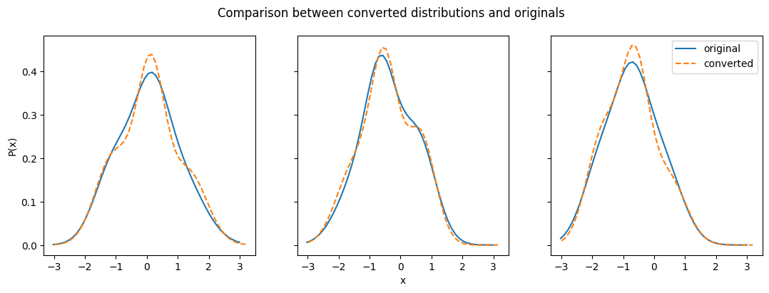
One factor here is that conversion to Gaussian mixture models requires an input number of Gaussian models per distribution (by default ncomps = 3). If not all of the distributions in your Ensemble contain the same number of Gaussian models (can be done by setting values to 0), then you can get overfitting of those that are best fit by fewer Gaussian models, as you can see happening in the plot on the right.
Beyond this, even those distributions that clearly require more than one Gaussian have fits that depart from the original in some way. This is because the method used to convert to Gaussian mixture models takes samples from the input Ensemble distributions and then fits the sampled data. This method is inherently inconsistent, due to the random nature of sampling and the dependence on fitting algorithms. This means that converting to a Gaussian mixture model from the same Ensemble multiple times can give you different results each time.
Let’s explore some other conversion methods to see how they perform.
Converting to interpolations
Interpolations are quite similar to histograms in terms of data structure. Converting to an interpolation requires a set of x values, and those x values need to cover the full range of all the distributions in the Ensemble. Let’s use the same range and number of values as the histogram to convert to an interpolation, and take a look at our distributions.
ens_i = qp.convert(ens_h,"interp",xvals=np.linspace(-4,4,40))
fig, axes = plt.subplots(1,3, sharex=True, sharey = True, figsize=(13,4))


# we use a bar to plot the histogram since we already have the histogram values
axes[0].bar(ens_h.x_samples(),ens_h[2].pdf(ens_h.x_samples()), width=ens_h.x_samples()[1]-ens_h.x_samples()[0], alpha=0.9)
axes[0].plot(ens_i.x_samples(),ens_i[2].pdf(ens_i.x_samples()),c="k")
axes[1].bar(ens_h.x_samples(),ens_h[15].pdf(ens_h.x_samples()), width=ens_h.x_samples()[1]-ens_h.x_samples()[0], alpha=0.9)
axes[1].plot(ens_i.x_samples(),ens_i[15].pdf(ens_i.x_samples()),c="k")
axes[2].bar(ens_h.x_samples(),ens_h[53].pdf(ens_h.x_samples()), width=ens_h.x_samples()[1]-ens_h.x_samples()[0], alpha=0.9, label="original")
axes[2].plot(ens_i.x_samples(),ens_i[53].pdf(ens_i.x_samples()),c="k", label="converted")
axes[1].set_xlabel("x")
axes[0].set_ylabel("P(x)")
axes[2].legend(loc="best")
fig.suptitle("Converting histograms to interpolation")
Text(0.5, 0.98, 'Converting histograms to interpolation')

Not surprisingly, this conversion gives us a good match between the distributions.
ens_i_lowres = qp.convert(ens_h, "interp",xvals=np.linspace(-4,4,10))
fig, axes = plt.subplots(1,3, sharex=True, sharey = True, figsize=(13,4))


# we use a bar to plot the histogram since we already have the histogram values
axes[0].bar(ens_h.x_samples(),ens_h[2].pdf(ens_h.x_samples()), width=ens_h.x_samples()[1]-ens_h.x_samples()[0], alpha=0.9)
axes[0].plot(ens_i_lowres.x_samples(),ens_i_lowres[2].pdf(ens_i_lowres.x_samples()),c="k")
axes[1].bar(ens_h.x_samples(),ens_h[15].pdf(ens_h.x_samples()), width=ens_h.x_samples()[1]-ens_h.x_samples()[0], alpha=0.9)
axes[1].plot(ens_i_lowres.x_samples(),ens_i_lowres[15].pdf(ens_i_lowres.x_samples()),c="k")
axes[2].bar(ens_h.x_samples(),ens_h[53].pdf(ens_h.x_samples()), width=ens_h.x_samples()[1]-ens_h.x_samples()[0], alpha=0.9, label="original")
axes[2].plot(ens_i_lowres.x_samples(),ens_i_lowres[53].pdf(ens_i_lowres.x_samples()),c="k", label="converted")
axes[1].set_xlabel("x")
axes[0].set_ylabel("P(x)")
axes[2].legend(loc="best")
fig.suptitle("Converting to interpolation with fewer bins")
Text(0.5, 0.98, 'Converting to interpolation with fewer bins')
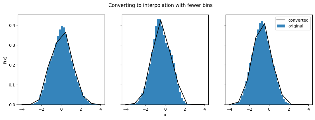
The converted distributions don’t match up nearly as well when there are fewer x values. This is relevant for all of the three parameterizations that have a set of ‘coordinates’ and ‘data points’ - histogram, interpolation, and quantiles. So keep in mind not just that the range should cover the whole distribution, but also what the density of points along that distribution is like.
Converting to quantiles
Let’s test out how well converting a histogram to quantiles works. Once again we’ve got to make sure that the quantiles cover the whole distribution space, but this time the distribution space is the probability, not the x values. So the full range is in the interval (0,1).
ens_q = qp.convert(ens_h,"quant",quants=np.linspace(0,1,20))
/home/docs/checkouts/readthedocs.org/user_builds/qp/envs/main/lib/python3.10/site-packages/qp/parameterizations/quant/quant.py:141: RuntimeWarning: There are non-finite values in the locs for the distributions: [ 0  0  1  1  2  2  3  3  4  4  5  5  6  6  7  7  8  8  9  9 10 10 11 11
 12 12 13 13 14 14 15 15 16 16 17 17 18 18 19 19 20 20 21 21 22 22 23 23
 24 24 25 25 26 26 27 27 28 28 29 29 30 30 31 31 32 32 33 33 34 34 35 35
 36 36 37 37 38 38 39 39 40 40 41 41 42 42 43 43 44 44 45 45 46 46 47 47
 48 48 49 49 50 50 51 51 52 52 53 53 54 54 55 55 56 56 57 57 58 58 59 59
 60 60 61 61 62 62 63 63 64 64 65 65 66 66 67 67 68 68 69 69 70 70 71 71
 72 72 73 73 74 74 75 75 76 76 77 77 78 78 79 79 80 80 81 81 82 82 83 83
 84 84 85 85 86 86 87 87 88 88 89 89 90 90 91 91 92 92 93 93 94 94 95 95
 96 96 97 97 98 98 99 99]
  warnings.warn(
This raises a warning that the locations of some of these probabilities are non-finite. This is because for Gaussian distributions, the location of a probability of 0 is usually positive or negative infinity. So instead, we’re going to have to pick a value very close to 1 and very close to 0, and let the code extrapolate to 0 and 1 from there.
For more details on what’s happening here take a look at the Quantile documentation.
ens_q = qp.convert(ens_h, "quant", quants=np.linspace(0.01,0.99,20))
fig, axes = plt.subplots(1,3, sharex=True, sharey = True, figsize=(13,4))


# we use a bar to plot the histogram since we already have the histogram values
axes[0].bar(ens_h.x_samples(),ens_h[2].pdf(ens_h.x_samples()), width=ens_h.x_samples()[1]-ens_h.x_samples()[0], alpha=0.9)
axes[0].plot(ens_q.x_samples(),ens_q[2].pdf(ens_q.x_samples()), c="k", marker=".")
axes[1].bar(ens_h.x_samples(),ens_h[15].pdf(ens_h.x_samples()), width=ens_h.x_samples()[1]-ens_h.x_samples()[0], alpha=0.9)
axes[1].plot(ens_q.x_samples(),ens_q[15].pdf(ens_q.x_samples()), c="k", marker=".")
axes[2].bar(ens_h.x_samples(),ens_h[53].pdf(ens_h.x_samples()), width=ens_h.x_samples()[1]-ens_h.x_samples()[0], alpha=0.9, label="original")
axes[2].plot(ens_q.x_samples(),ens_q[53].pdf(ens_q.x_samples()), c="k", marker=".", label="converted")
axes[1].set_xlabel("x")
axes[0].set_ylabel("P(x)")
axes[2].legend(loc="best")
fig.suptitle("Converting histograms to quantiles")
Text(0.5, 0.98, 'Converting histograms to quantiles')
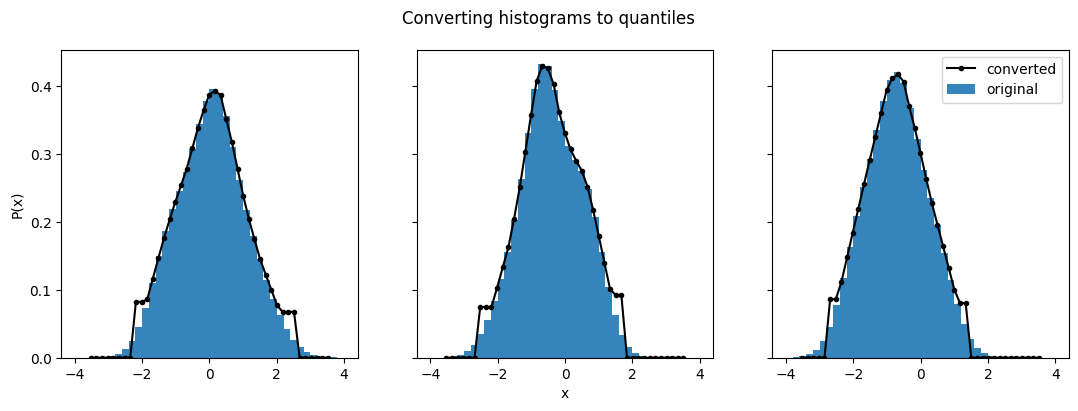
As we see here, the converted distributions match very well in the center of the distributions, but can be a bit rough at the edges. This is especially true because we picked a range from (0.01, 0.99) instead of (0,1). The closer you get to 0 and 1, the better those edges will be.